ICEE-EV’s Company Branding highlights our direction and vision – offering turn-key EV Charging Solutions.
ICEE-EV is recognised by our geometric icon, alongside our ICEE Logo, facilitated with certain areas of green. This allows us to differentiate our brand away from ICEE Managed Services, while still showcasing our parent company as the soul of our new EV Division. All communications should follow our company branding.
Our Logo
The ICEE-EV logo is built upon the same foundation as ICEE Managed Services, incorporating key design elements, across both brands. There are a variety of colour profiles, dependent on the use case of the logo. The logo should be used across all marketing material, ensuring our brand is continuously recognised across the EV Industry.
#013e42
#4dbb7a
#000000
#ffffff
Our Typography
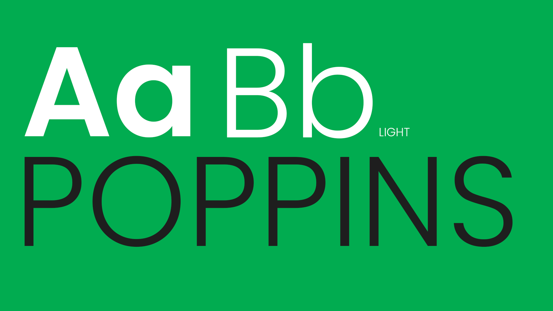
We utilise the Poppins Typography across our brand image. This includes our website, social media, print marketing & media, documents and information media. Poppins Semi-Bold is utilised only for headings, or to highlight a key part of a text. Poppins Light can be used for text extracts, smaller headings, as well as be used in full capital letters. All documents should reflect this font.
Photography & Digital Marketing

All Photography and Digital Marketing should be kept in line with our minimalist brand identity. Photography should be of a professional standard for any major marketing use cases. Acceptable use of Phone Photography is only valid for Social Media Content, and must still be processed by the Marketing Department. All video should be filmed in 4K, and then rendered down to HD (1080p).